Role
- UX researcher
- UX Writer
- Visual Designer
- Wireframing
- Interaction design
Tools
- Figma
- Illustrator
- Photoshop
- HTML/CSS
- Website Builders
Duration
20 weeks
Team
Solo
Problem & Solution
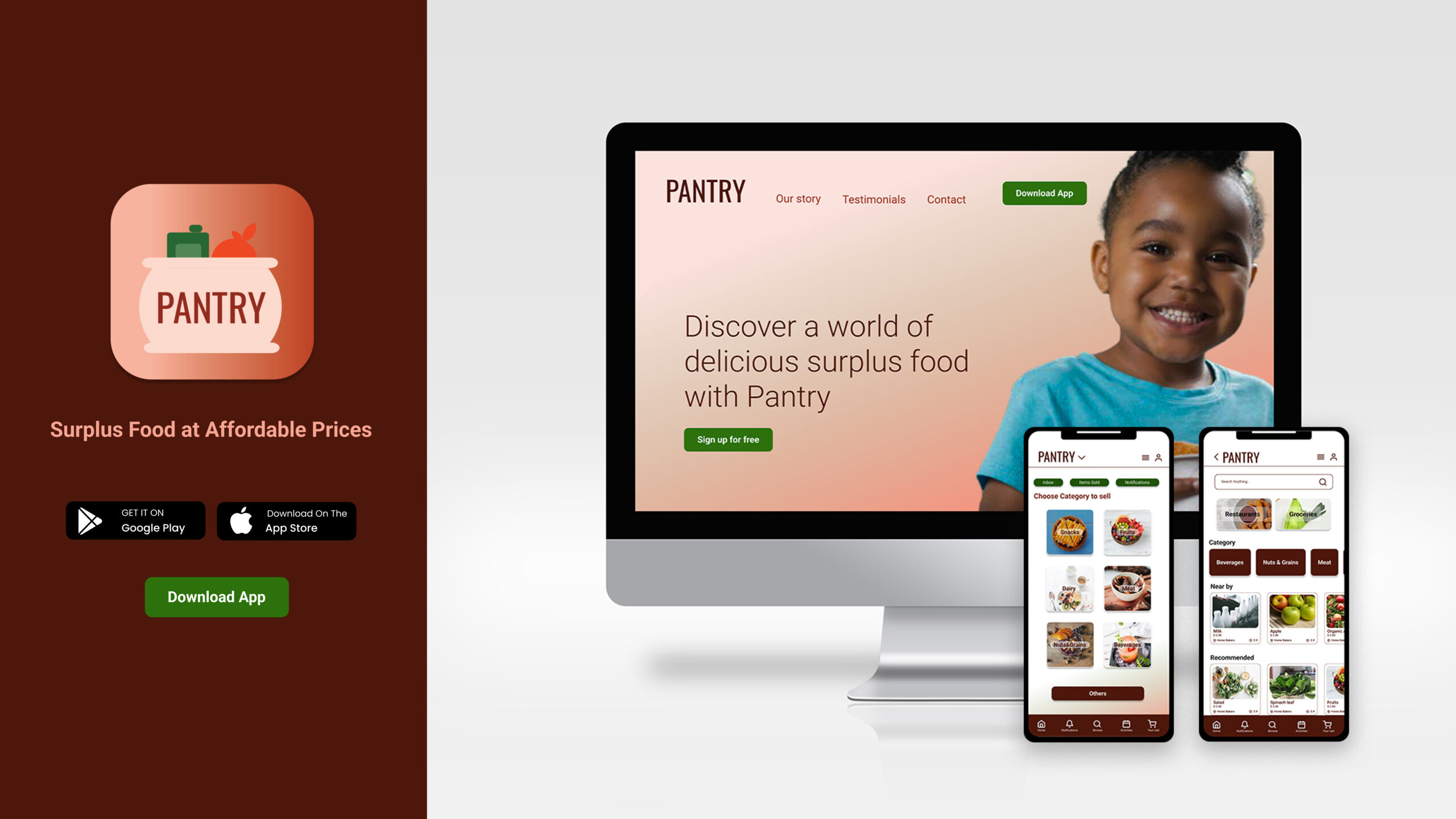
Through my research, I identified the pressing problem of food waste and its impact on food security and the environment. To address this, I created the Pantry app as a platform that connects surplus food sellers with buyers, offering affordable and nutritious options to minimize waste and ensure everyone has access to quality meals. The app allows users to discover a wide range of surplus food items and purchase them at reduced prices, while also empowering individuals to sell their excess produce or food items. With a focus on user experience, visual design, and a seamless app flow, Pantry serves as a practical and user-friendly solution, promoting sustainability and community engagement.
Research & Content Strategy
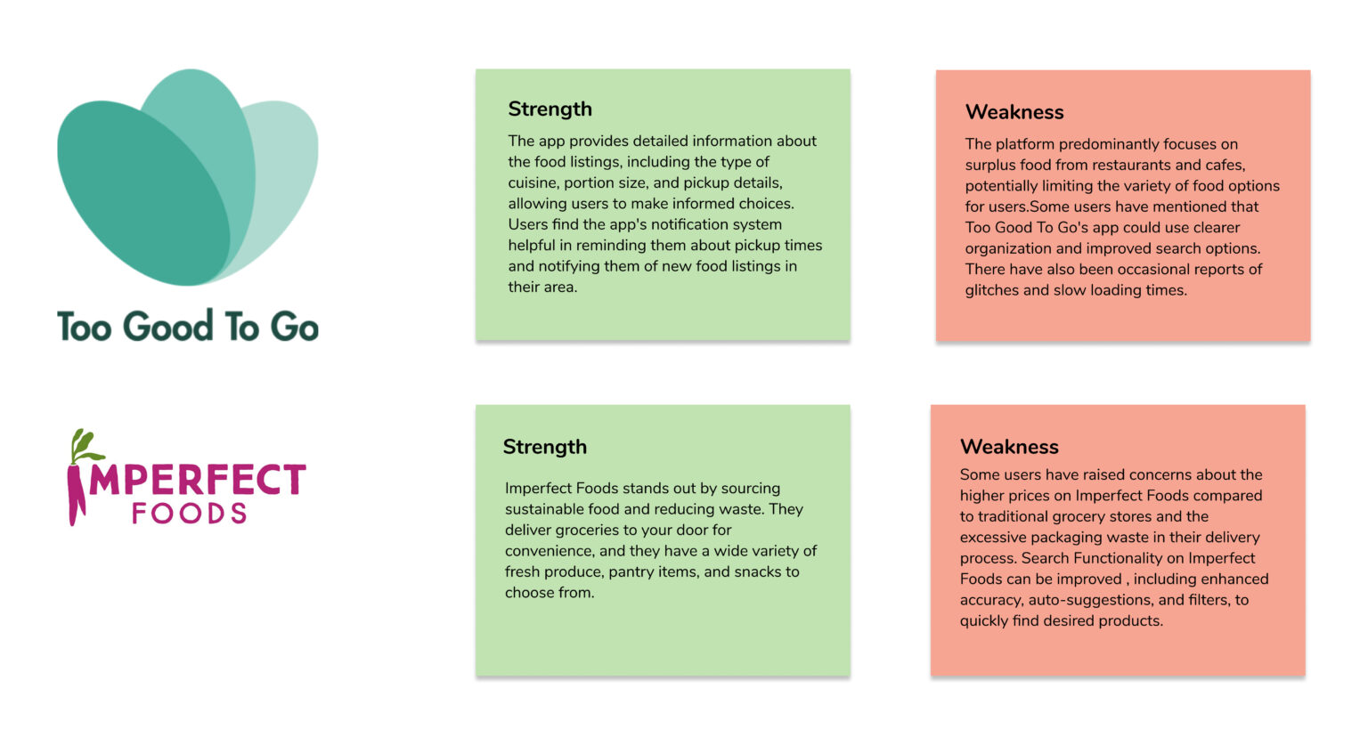
I explored existing apps and social platforms that addressed the problem of food wastage and food insecurity. While I discovered several solutions catering to events and grocery stores, I noticed a significant gap in the market. None of these platforms provided a dedicated space to connect households with surplus food and produce to potential buyers. This insight highlighted the unique opportunity for Pantry to fill this void and offer a solution that connects individuals directly, fostering a more sustainable and efficient way to address food waste.
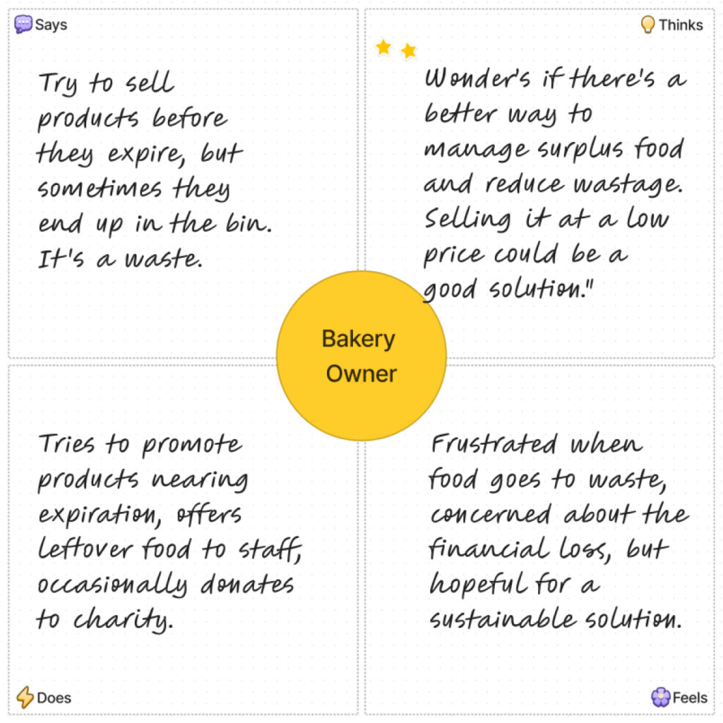
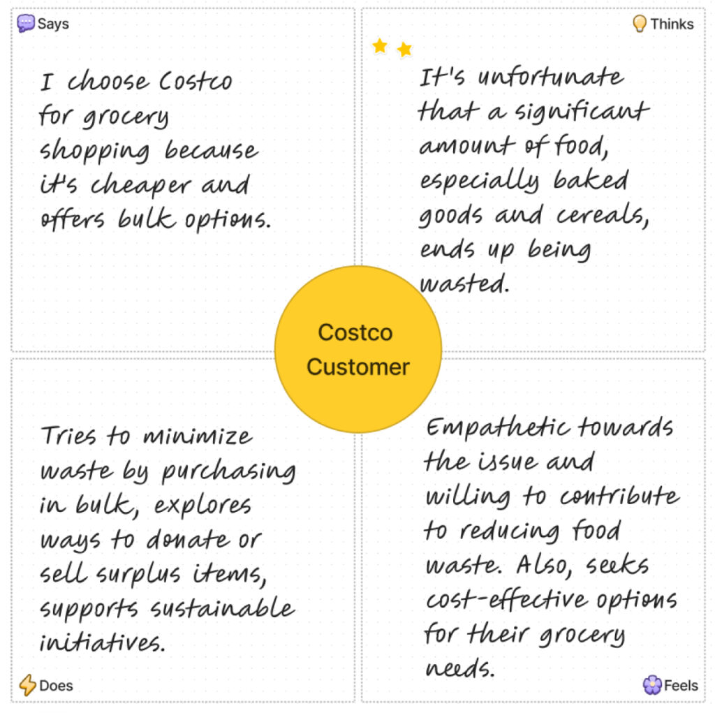
After identifying the gap in existing solutions, I conducted thorough research for the Pantry app. I began by interviewing various stakeholders, including bakery owners, Costco customers, and garden owners, to gather valuable insights for designing a solution that effectively addresses the problem of food wastage.
Competiter Analysis
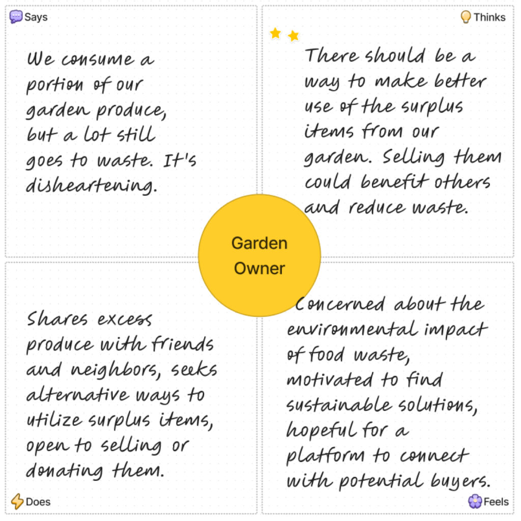
Empathy Map
Jobs to be done
- Connect sellers with surplus food to buyers:
- I want to provide a platform where households, grocery stores, and bakeries can easily connect with potential buyers interested in purchasing their surplus food and produce.
- To help users find affordable food options:
- I aim to create a solution that helps users discover and buy surplus food at lower prices, allowing them to save money on their grocery expenses.
- To minimize food waste:
- I want to empower users to sell or donate excess food items through the app, ensuring that they are utilized instead of being wasted.
- To ensure freshness and quality:
- I strive to design a reliable platform that guarantees the freshness and quality of the surplus food being offered, giving users confidence in their purchases.
- To promote sustainability and community support:
- I am committed to supporting sustainability efforts by creating a platform that encourages the purchase of surplus food, helping reduce food waste and fostering a sense of community.
Northstar Statement & Kvps
Kvps
- Pantry will increase food security.
- Conserve resources by preventing food waste.
- Provide quality food.
- Bring households, stores and reastaurants on one platform.
- Treat food for hunger relief not for waste.
User Persona

- Name: Emily Thompson
- Occupation: Full-time student
- Age: 20
- Budget-conscious individual with limited financial resources.
- Seeking affordable and convenient food options.
- Often in need of late-night snacks or quick meals.

- Name: Davi Wilson
- Occupation: Sales Manager
- Age: 40
- Responsible for grocery shopping for the family.
- Looking for everyday essentials like bread, milk, and other household items.
- Value convenience and time-saving solutions.

- Name: Thomas Turner
- Occupation: Retired Teacher
- Age: 65
- Enjoys gardening and has surplus garden produce.
- Interested in selling or sharing excess garden items.
- Seeks a platform to connect with potential buyers or local community members.
Design Process
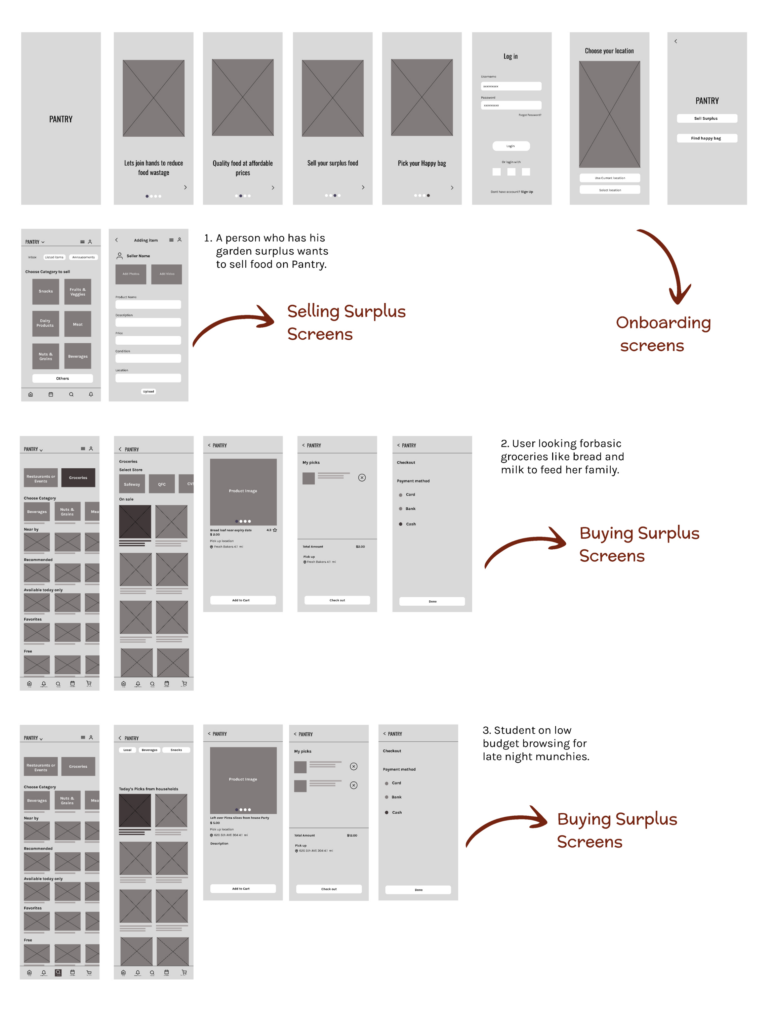
User Flows
- A person who has his garden surplus wants to sell food on Pantry.
- User looking for bread and milk to feed her family.
- Student on low budget looking for late night munchies.
Low-fidelity wireframes
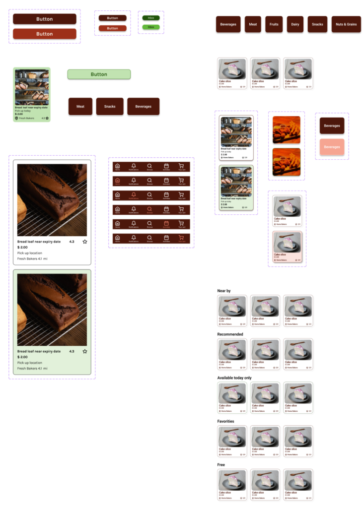
Atomic Design Methodology for Hi-Fidelity wireframes
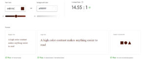
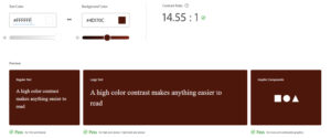
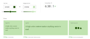
Color Accessibility Test
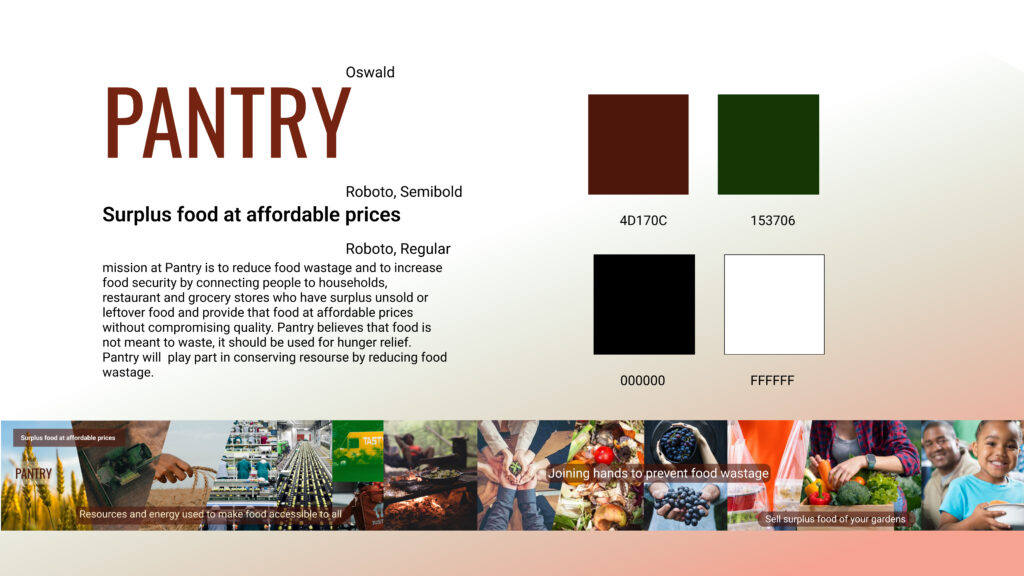
Logo & Graphics
For the logo & graphics, I opted for simple illustrations that reflect food and sustainability. The logo features clean lines and elements that represent freshness and abundance. In terms of graphics, I used minimalist illustrations to convey the concept of surplus food and eco-friendly practices
