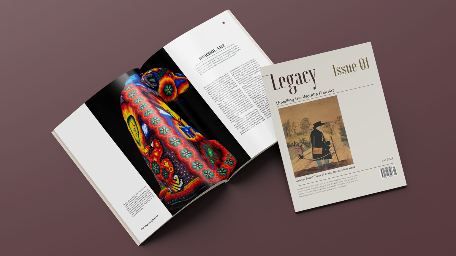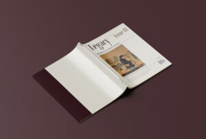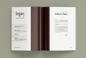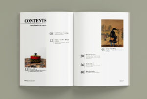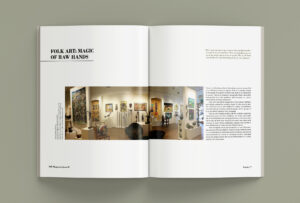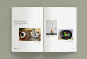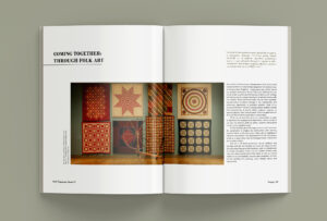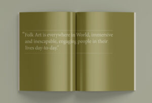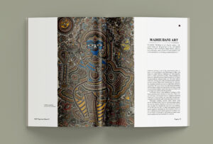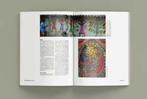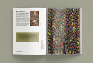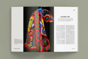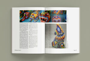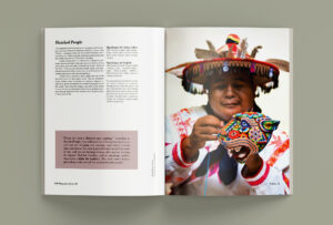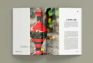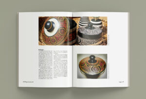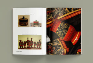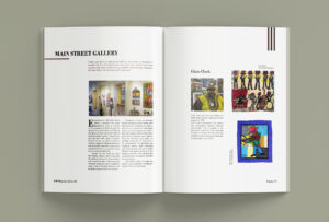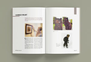
Legacy Magazine is a special platform that celebrates and protects traditional folk arts from different parts of the world. It acts as a bridge between the past and present, taking readers on an exciting journey through various cultures and their artistic traditions. By creating a space for learning, sharing, and connecting with these art forms, Legacy Magazine aims to inspire and empower underrepresented artists. This is the first issue of Legacy, and as a passionate advocate for folk art, I’m thrilled to contribute something meaningful to society’s appreciation of these valuable artistic treasures.
Role
Tools
- InDesign
- Figma
- Illustrator
- Photoshop
Duration
10 weeks
Team
Solo
Problem & Solution
Demographics
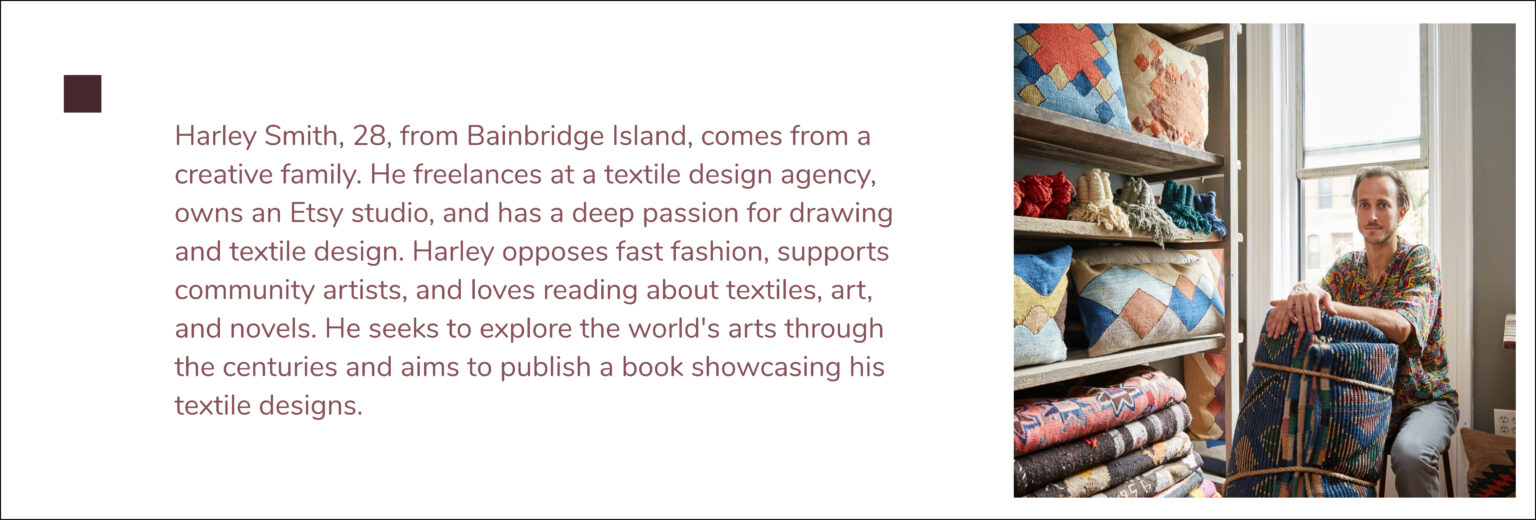
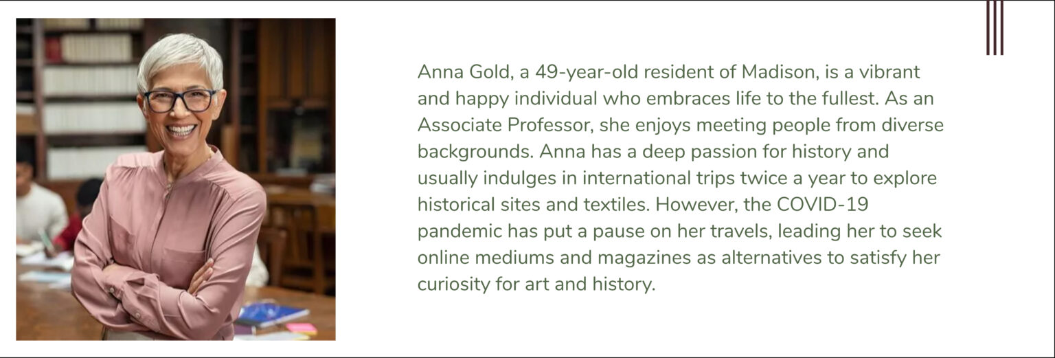
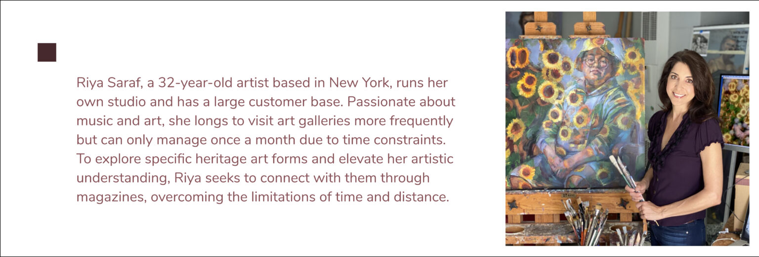
Legacy Magazine primarily targets a vibrant audience of young adults aged 18-30 who possess a deep interest in traditional arts, diverse cultures, and the wonders of travel. However, the magazine’s captivating content and thoughtfully designed layout also resonate with a broader readership. This includes art enthusiasts, collectors, educators, students of art and cultural studies, as well as individuals with a genuine curiosity about various cultural practices and traditions. By catering to this diverse range of readers, Legacy Magazine aims to foster an inclusive and enriching experience for all who appreciate the beauty of heritage arts.
Layout and Mood Board
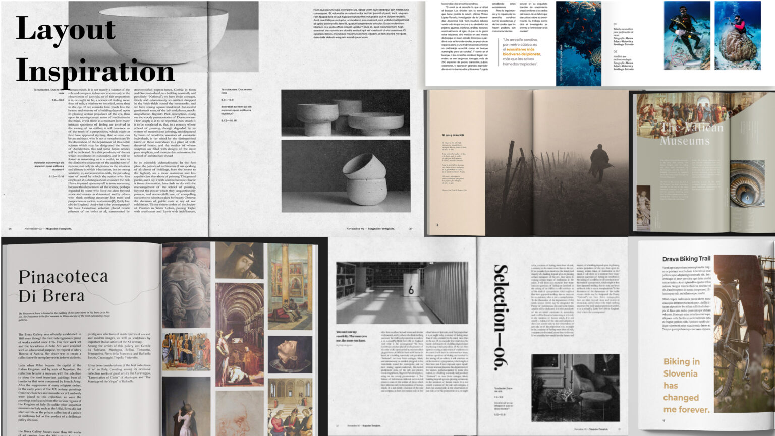
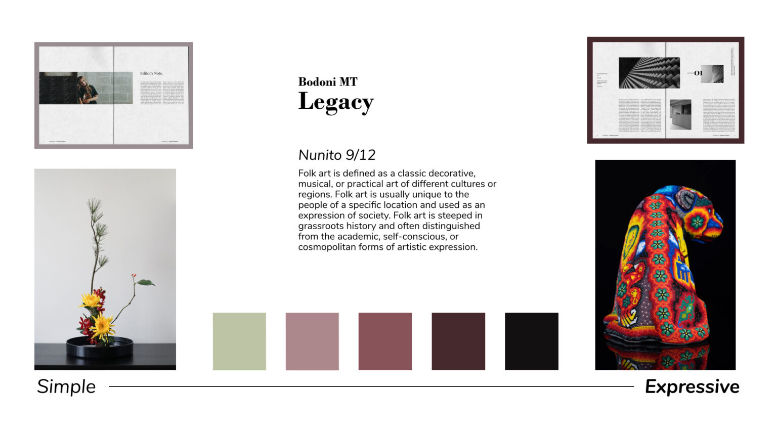
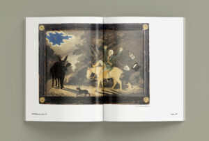
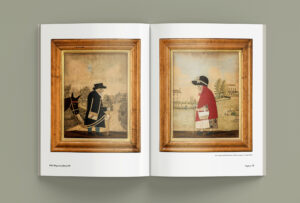
When designing the layout and color scheme for the magazine, I began by gathering inspiration from various sources. After careful consideration, I chose a muted color palette to achieve a sophisticated and understated look. This decision was made to ensure that the vibrant and diverse folk art showcased in the magazine remained the main focus. The muted colors created a sense of harmony and balance, enhancing the overall design. In the initial articles, I opted for a minimal layout with soft tones, aiming for a clean and elegant aesthetic. As the magazine progressed, I gradually introduced more expressive images and played with layout and graphic elements. This added visual interest and brought out the essence and emotion of the featured folk arts. The evolving layout and graphic choices helped engage readers and create a captivating visual narrative throughout the publication.

